Grw
GRW Investment App — UI/UX Redesign
Full redesign of a fintech investment app — scalable design system, dark/light modes, and full RTL/LTR parity.
Client
Grw
Services
Grw
Timeline
Grw
Year
2025
Project Screens
Case Study
The starting point
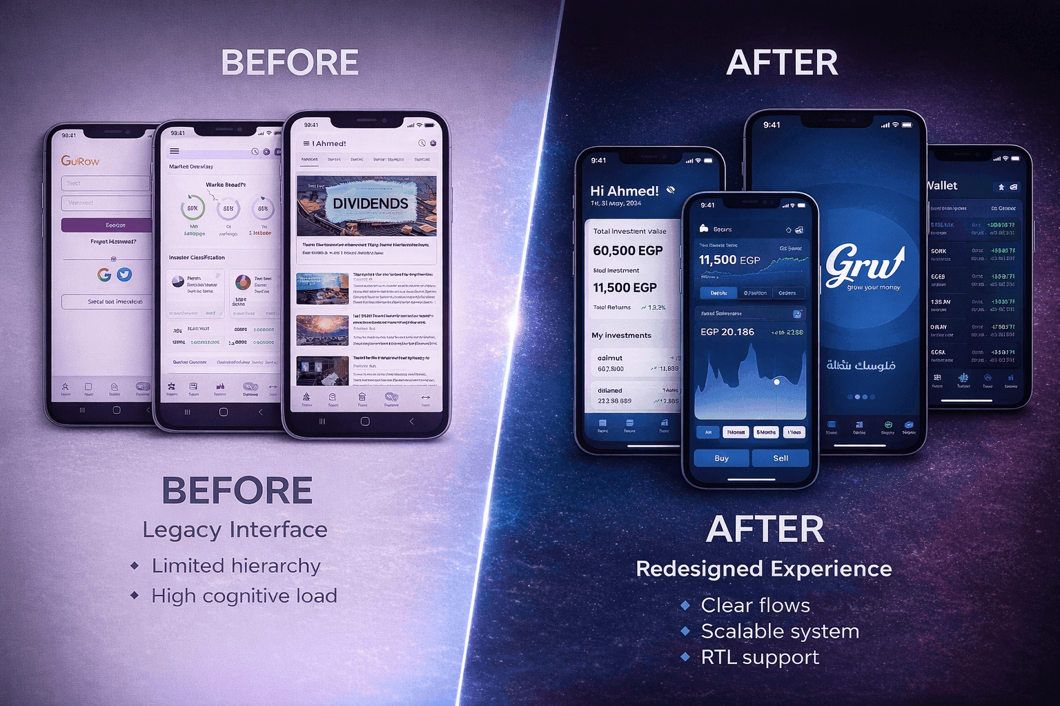
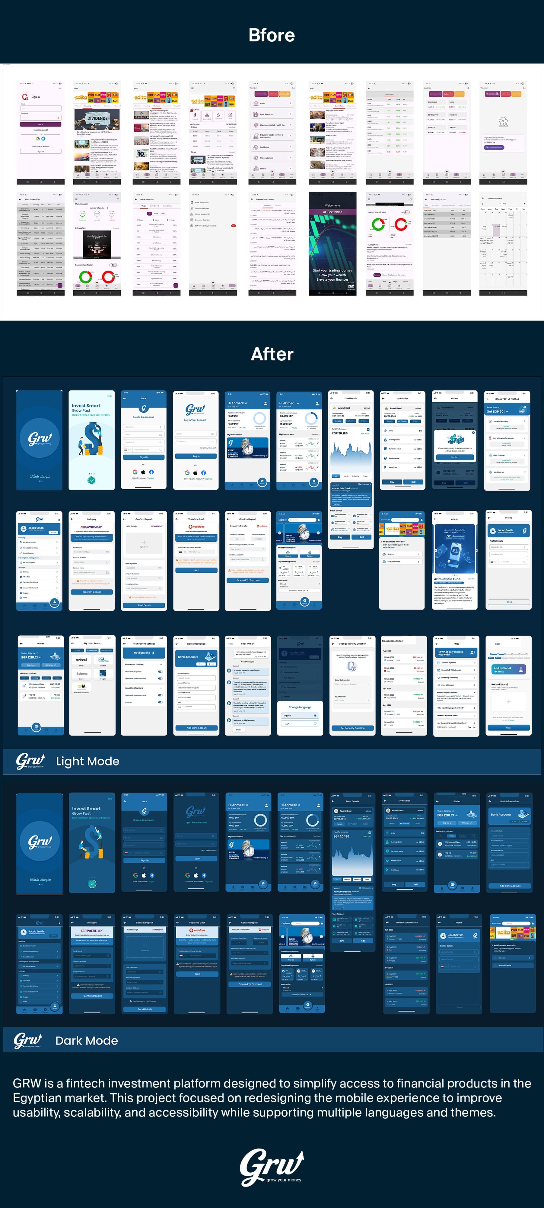
The legacy app was overloaded — dense screens, weak hierarchy, and no real structure for the data. It worked, but it made users work hard. The brief was to redesign it properly, not just restyle it.
What I focused on
I restructured the navigation around real user journeys: onboarding, exploring products, tracking a portfolio, and reading market news. Each flow got its own space — no more everything-on-one-screen.
The design system was built from scratch: a component library that supports light mode, dark mode, Arabic (RTL), and English (LTR) consistently. Typography was tuned specifically for numeric-heavy financial content.
Result
A cleaner, faster app that works the same in both languages and both themes. Design system is ready to scale — any new feature has a home in the existing structure.